Disclaimer: this is a translation from the original post in Spanish at Incognitosis, my personal blog. The Unshut was a project to write in English about tech, but I decided to stop a couple of years ago and it hasn’t been updated since. This post has been translated with DeepL and lightly edited. Apologies for the quick process.
The Verge was born on November 1, 2011. The publication that has long been an absolute benchmark in the world of technology journalism took its first steps, and did so with a vibrant design.
Not that that design was particularly different from what was being seen in other media, but it was an almost logical step forward: a large carousel with a commitment to the visual with the highlights of each moment, and then chronologically ordered content. There were also interesting bets such as the comments section, which theoretically was going to give special prominence to the readers if they worked hard, although as far as I know that never took off.
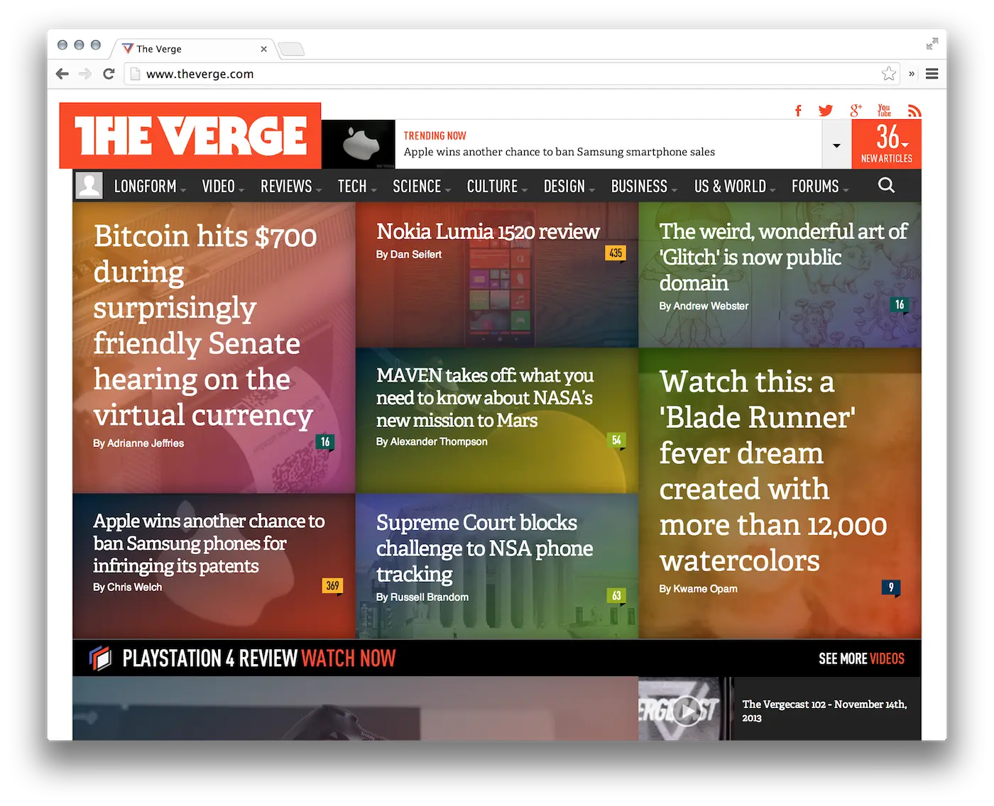
The design has remained the same for years and there were only minor changes. It took them a while to add the search button, and also to make the design responsive so that it would adapt better to mobiles.
As I commented in that topic, there must have been quite a few internal earthquakes in the team: of the original founders, all ex-Engadget, Nilay Patel is the only one really standing. Neither Joshua Topolsky (I’ll talk about him later) nor Paul Miller -they always looked like a trio of inseparable colleagues- are there, and lately there have been movements such as David Pierce, who left for Wired (and now has just returned to The Verge) or Dieter Bohn, who announced a few months ago that he had joined Google.
Be that as it may, The Verge has been going like gangbusters. Using the basketball analogy, it is as if they were the US national team and Xataka —where I work as a senior editor— was Spain. In traffic we do not seem to be so far away (36 million uniques/month at Xataka according to Similar Web, I will not go into whether they are right or not, The Verge 46 million), but for those who read technology what is clear is that The Verge is the king. Or they almost are.
They have earned that reputation, although in recent times I notice them lazy: few new topics every day, and of those few that are worthwhile, something that is a bit sad for a site that is really supported by manufacturers and advertisers: they give them products and exclusives to which other competitors have no access. That’s okay, that’s how the world works, but with that level of privilege they could do even better.
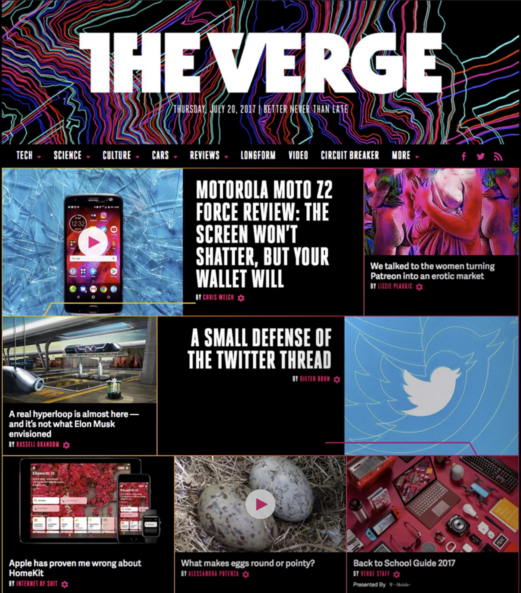
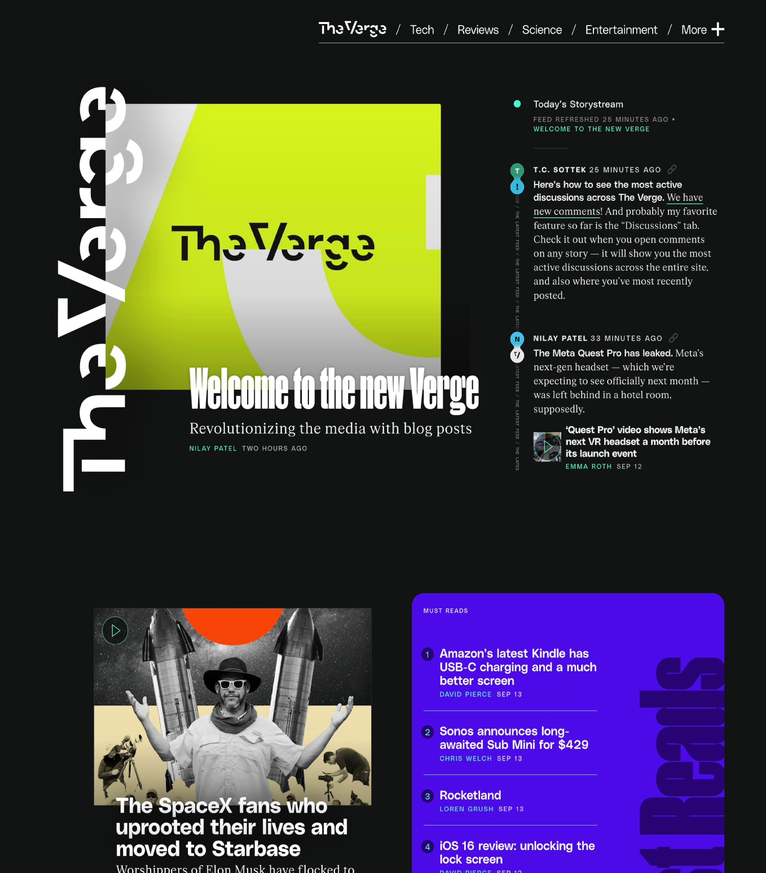
The fact is that today The Verge has released its redesign. There was no warning -at least, as far as I remember-, and of course the release has caused quite a lot of comments both in the official announcement and on social networks like Twitter, where criticism has been rampant.
When I heard about it, I went like a hotrod to its page. The first impression? “Ugh, how weird is this”. The homepage is a succession of diffuse blocks of white text over a black background. Alternating left and right are featured content and special content blocks, but there’s no clear structure, no “look, here’s what we think is the most important thing right now” highlighted at the top, as other media (and most newspapers) do.
No. At The Verge they’re not so much a media outlet as an aggregator. Suddenly they don’t particularly highlight anything, and their ‘Storystream’ dominates with a concept that reminds a bit of Facebook or Twitter. And it does so because here there is not only content from The Verge, but they are also adding blocks in which they recommend reading other media. The result? As I was saying:
The Verge is no longer so much a media, I insist, but an aggregator. At least that’s what it looks like when you go through that home page. As soon as you come across that special presentation post, as with a couple of small paragraphs that seem to be a kind of Twitter embedded in a web -I just saw that Axios has just qualified this redesign– and then mixed with more things. With headlines of their own content (without an inline), with blocks of topics classified in the same category, or with content from other embedded media that could also be a tweet, an Instagram post, a TikTok or YouTube video or who knows what else.
That idea doesn’t really work for me. It has some cool things, of course. I understand that they want to become a kind of “portal” like those of the first internet era. A site that technology readers have as a reference site because they know they will not only have good content and criteria from The Verge, but also recommendations on topics that they don’t get (or get late) from other media. “Hey, don’t worry, everything important in technology will be here. And if we don’t have it, don’t worry, we’ll send you to where you can read it”.
The idea is smart – and certainly powerful – but also dangerous. What I have seen in this first approach makes me think that The Verge wants to have less of its own content and use more of others’ content because, if users go to its home page as the first visit of the day, traffic to that home page will skyrocket and advertisers will flock to it. But aggregators are not doing so well as far as I know (Techmeme is cool, but it’s dedicated to aggregate and that’s it) and this is a kind of in the middle of nowhere.
I’m not just worried about that: I’m worried that Patel was saying in that introductory announcement that in analyzing what they thought was important was that “oh shit, we just need to blog more.” What? That doesn’t make much sense: the word blog has lost all its prestige, and those who started that way have always wanted to become a means to become “serious”.
One thing is certain in this media thing: in many cases we all end up rehashing the same thing. Apple releases the iPhone 14? You have to write a post about the iPhone 14, even if what you do is hardly going to be any different from the 200 other tech media outlets covering it. The Verge seems to want to get rid of the rehashes:
What’s most exciting about all this is that it will actually free up time for our newsroom: we won’t have to stop everything we’re doing and debate writing an entire story about one dude’s confused content moderation tweets. We can just post the tweets if they’re important, add the relevant context, and move on. That means we’ll get back hours upon hours of time to do more original reporting, deeper reviews, and even more incisive analyses — the work that makes The Verge great.I disagree. Original reporting and analysis are important, no doubt, but what makes The Verge great (in my opinion) is that they give me 1) context and 2) opinion of value. The former is important because it makes you understand the scope of what they’re talking about. Why it’s important, how it affects me. The second, because it differentiates that content from other content: I know the names of those editors (and many others) because I read them often and I value how they write and give their opinion, because I find their criteria valid and because I really like to read what they think about a product, a service or anything that happens in technology. I like that they are critical but fair. Merciless but complimentary. Give to Caesar what is Caesar’s, both for the good and the bad. That’s what I try to do every day at my blog and at Xataka.
So, what that paragraph seems to me is an excuse. One to say: “let’s write less, others already do it”. I want to read why it is important that a new basic Kindle comes out. In this case The Verge has covered it, but with that message what they are telling me is that they will make much less content of that kind because everyone is already going to talk about the new Kindle.
The truth is that this message worries me, because as I said before The Verge publishes quite little. Considering the resources and money they have to manage, one would expect them to be much more productive, but here it seems that what they want, I insist, is to publish less of their own stuff and more of others. A quick look at the Archives suggests that the idea might work: this is after all like a Twitter account where they link to themselves, but also to others, so if you trust The Verge, you will “follow them” (that is, you will go to their home page) and they will get what they wanted, which is that you end up on that home page. The technique is cool, but the redesign still fails for several reasons. In my review I have noted several things, so here they go:
- Logo. The Verge logo changes because, according to Patel, it proposed “an interface between the present and the future”. That as an explanation of the logo is fine, but now that logo is difficult to read, and if it is difficult to read it is simply not cool.
- Goodbye to visual content. Text dominates here, which makes it more difficult to visually scroll through your entire home page. You zig-zag not only between blocks on one side and the other, but also between types of content: small paragraphs with embedded content or links, own topics with a larger headline but without an intro, special topics and highlights that have an image, headline and intro, blocks of several topics in the same category, tweets, YouTube videos, other embedded content… a mess of usability. You have to be very focused to “scroll through” that content, at least on a desktop computer. That lack of images may be to save on page weight: the home page is long in its vertical path, and in fact after each topic itself appears the StoryStream. I don’t know if I like that.
- The content itself seems to lose prominence. It is what I was saying, that now it is “hidden” among other content or mini-paragraphs that link to own content but something old. It is as if I suddenly read an article on nuclear energy by my colleague and friend Juanky but I read it a day late and I highlight it in a mini-paragraph on the front page of Xataka linking it. It was already on the front page yesterday, but that’s okay, we reuse it like that. Weird. I wonder how this will impact the pace and length of The Verge’s topics (skimpy reviews for the most part, though they certainly cut to the chase and save the crap of other reviews that might go on too long).
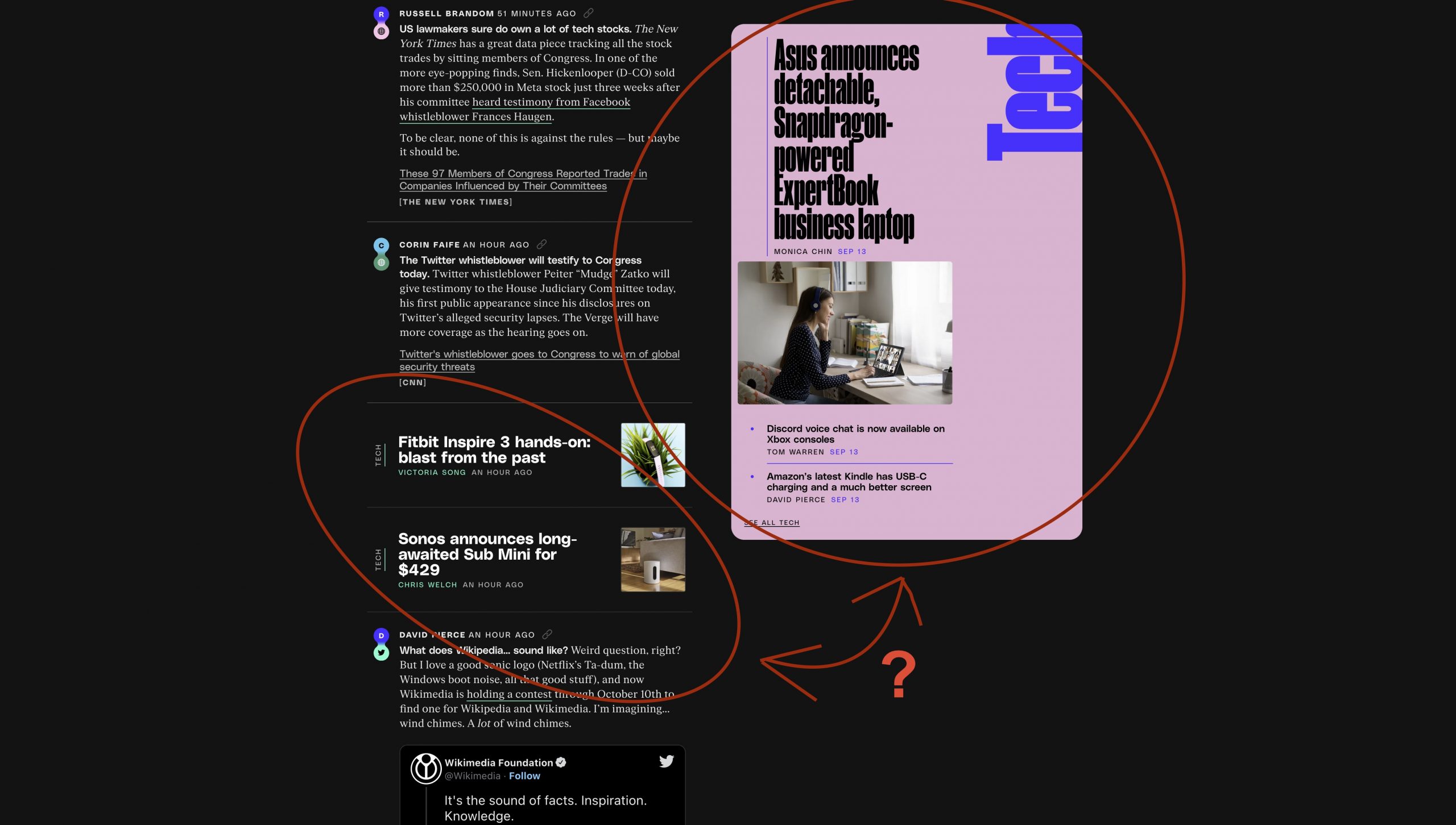
- Where is the most important thing. Having a block of featured content -bigger images, big headlines- is a first for Digital Media. Readers don’t want to complicate their lives, and they like to be visually facilitated in the arrangement of information. Here there are no more such aids, and suddenly we find that “Storystream” flow that confuses and mixes own content with outside content. They have created a “Must Read” section (also from the first year of media: don’t send anything to people, who take it badly) with contents that seem minor (small headlines, no images, no intros, meh). See right image with the blue block. Wrong.
- Comments, a nightmare. It’s already lazy enough to read comments without having them presented in this way. In The Verge the new system, called Coral, makes that when you click on comments (if you count the link, which is not very good) that block to read and comment scrolls to the left the main content or completely covers it on the mobile. In my case, that I read most of the time in split screen, the result is a poop, because it covers only half of the content. Not only that (I): the colors and fonts don’t work for me and make those comments not very legible. Not only that (II): they let organize by highlights, older or newer, but they show the highlights from the beginning, which logically are usually positive (at least when talking about this redesign). Once again, usability and readability worsen compared to the old, more classic approach.

- Blocks. In addition to the ‘Must Read’ block with the theoretically featured stories they have the Podcasts, Most Popular, Reviews, Science, Entertainment and, curious, Creator block (for topics from instagrammers, tiktokers, youtubers and so on). I don’t know how much some of these will be updated, but it seems difficult to pace them all well enough. We’ll see.
- Fonts. Kudos for using serif in the text -more professional and serious, less informal, that’s why I’ve been using it here for years- but the headings are deceiving. As you can see in the image, one sees an image and a headline believing that it is an own topic -which theoretically is relevant and is more prominent because of that- and no: one finds that this link leads to a topic in tweet format, a paragraph that then links to an external media. Weird and disappointing.
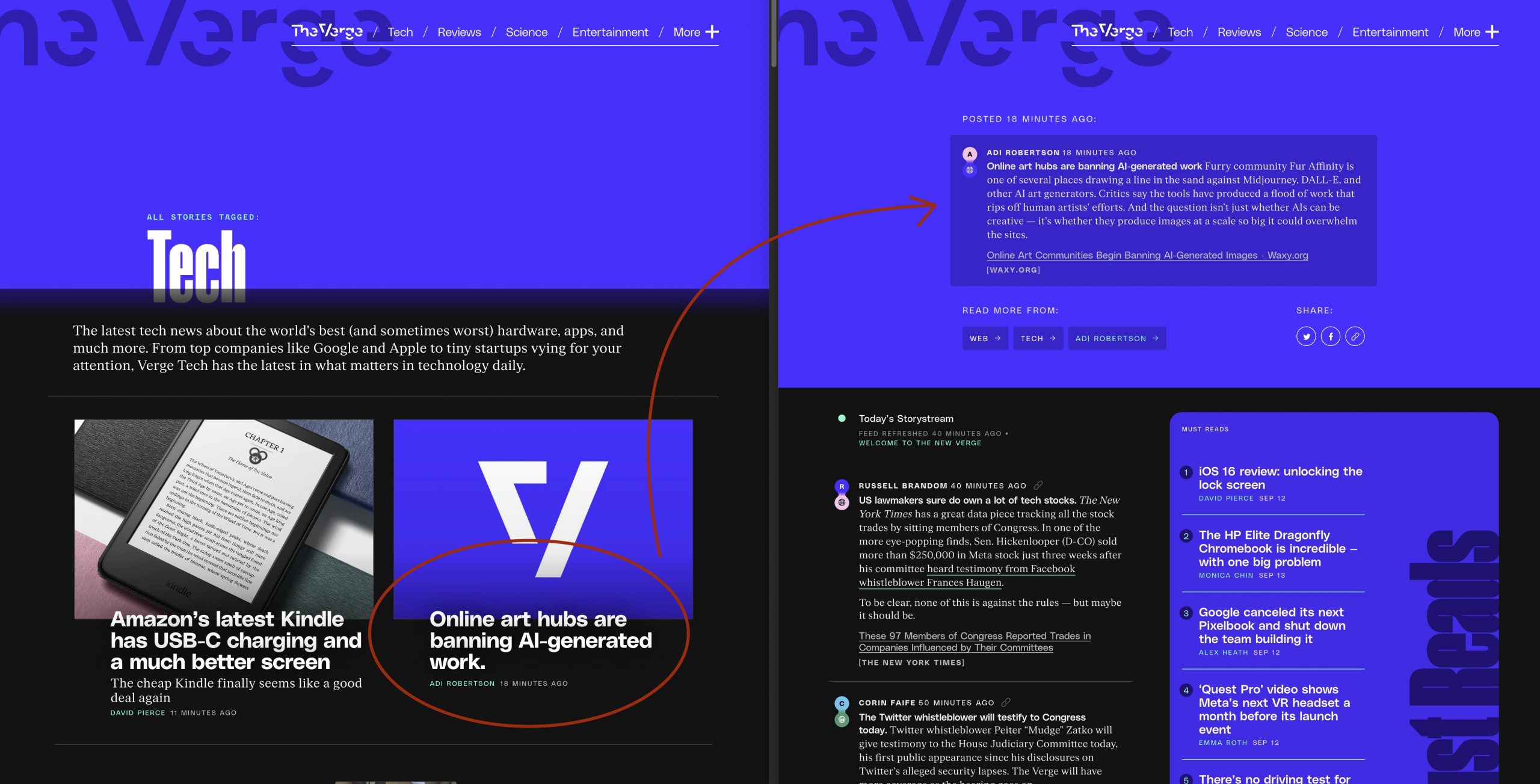
- Who do you belong to? As I’ve been saying, The Verge is more than ever a portal, a content hub. Yours matters, but everyone else’s matters too. That’s not necessarily a bad thing (it’s the best thing about the whole redesign, in fact), but there’s no easy way to tell if something is theirs or from outside. Unless the post is in tweet format and you see that at the end the link takes you outside, nothing, but they also use that tweet format to relaunch their own content. Wrong.
That’s a bit of a summary of what I’ve seen in this first review. There are some additional curiosities, of course: there is no search option on the web itself: if you want to find something, Google it with the typical ‘site:theverge.com’ modifier accompanying the search terms.
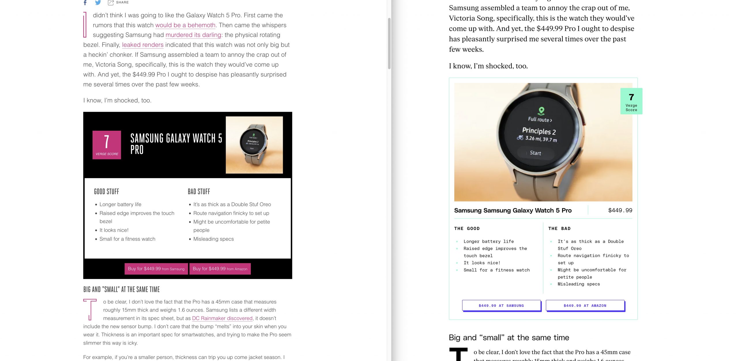
Beyond that, what is clear is that The Verge has plenty of capacity and resources to make long and different topics. This last one is a good example -I haven’t read it, the topic doesn’t call me-, and I certainly hope they follow that line that certainly differentiates them. I insist: with their resources (or the ones they seem to have) this kind of things should be constant, and not in drips and drabs as they have been doing so far.
Then there is the other issue. That of the snapchatization of web design in media. I talked about it quite some time ago, when the aforementioned Joshua Topolsky founded The Outline in 2016. My relationship with that media was practically null: I don’t follow them and I didn’t even see their topics particularly catching on the internet. The design was original to a fault, but it turned me off even though the topics might be interesting. In the end the company was acquired by Bustle Digital Group, and just a year after that operation, The Outline stopped updating (its contents, curiously, are still available). Apparently Topolsky and Bustle’s CEO were radical opposites, so it didn’t look good.
When it left there it didn’t really leave (I don’t know this well) because Topolsky created Input Mag, which premiered on December 16, 2019 and posed a very similar bet to The Outline. Snapchat design that was a little garish, a little off-putting, and content that went outside of rehashes and went to bizarre topics.

There he has continued to write quite a lot, apparently. I don’t follow him, but not because I don’t want to, but because for some reason I’ve been blocked on his Twitter for years.
I don’t know what happened, because he’s a guy whose vision is very much aligned with mine when it comes to editorial issues (not so much design) and whose critical vision I like and who doesn’t bite his tongue. But something I must have said to him on Twitter that got him hot under the collar. Anyway.
Here I must say that giving an opinion on a redesign a few hours after seeing it is perhaps a bad idea, especially when the redesign is so radical. It is difficult not to shock and not to feel resistance to that redesign, because at the end of the day human beings do not like changes and that their routines no longer work. My criticisms are (I think) reasonable, and join many comments I have seen on Twitter:
That last tweet is especially striking. Cybart is the head of Above Avalon and is quite well known in the tech media world, and his message -that the redesign is to capture more page views-, although a bit platitudinous, makes sense. This redesign is done to get more people reading your home page. I wouldn’t say it’s a change of business model as he claims: it’s reaffirming his model, which is advertising, and getting more exposure by capturing more and more readers with this new aggregator philosophy.
There are some good ideas and also good criticisms -especially in the comments of the official post- but I would say that a priori this design does not convince me almost nothing. What does is the idea of becoming an “aggregator”, a sort of iteration of Twitter is really interesting and it might achieve its goal: that of catching more users for longer on its home page.
It remains to be seen if it succeeds, of course, but in terms of design, the result, at least in its desktop version, does not convince me. On mobile there is not so much jump, the vertical structure helps, but on desktop? As I said, weird. It may again be a matter of getting used to it, but a priori it seems less usable and readable, more confusing and difficult. I’m not at all sure that they were right with these decisions, but time will prove them right (or not). If so, I’ll go over this to recognize that I’m a big mouth and that I have no idea about web design.
Which may also be the case.