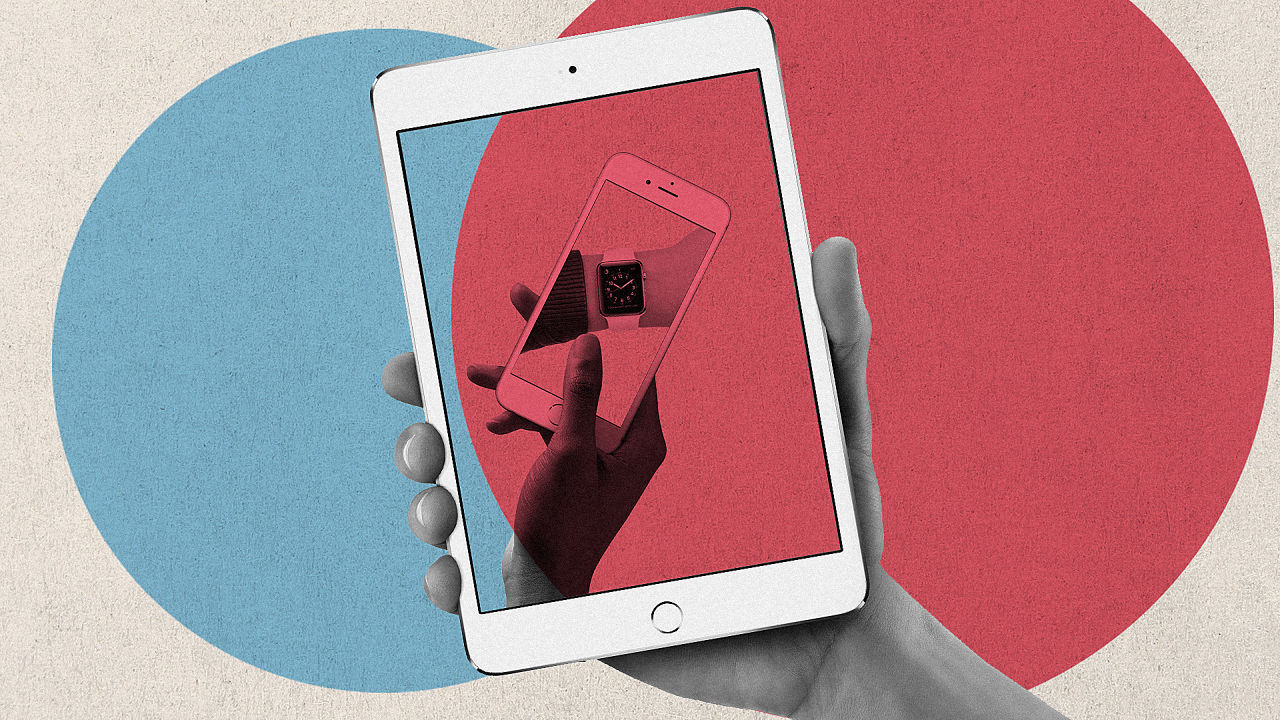
For years, Apple followed user-centered design principles. Then something went wrong.
Deep, thoughtful article by Don Norman and Bruce Tognazzini on Fast.co that explores design guidelines at Apple and specially on iOS. “Apple is destroying design“. Those are harsh words from Norman, one of the most revered professionals in design.
The problem lies not only in software design, but in software from Apple as a whole. This was discussed by people such as Marco Arment a few months ago in “Apple has lost the functional high ground” (he promptly wrote a follow up to that post). On that post he wrote:
Apple’s hardware today is amazing — it has never been better. But the software quality has fallen so much in the last few years that I’m deeply concerned for its future
And it seems those fears are shared by Chris Pirillo, who has written about this a few hours ago:
This is not a discussion over missing features that would be nice to have — it’s about glaring omissions in perfecting the features that are currently in place (designing a usable product from top to bottom, hard bits to soft bits). The shortcomings may never be addressed simply because it doesn’t seem that anybody at Apple has an eye for software detail, anymore.
The problem is clearly there. It’s not unique to Apple, though, but for a company that was so prevalent in good design, this is troublesome.


