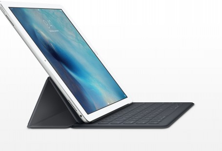
Google’s Pixel C has a smart aspect ratio, but what about the stylus?

The aspect ratio on Google’s new tablet is the square root of two. Why?

Brian Barrett gives us an explanation of the weird aspect ratio ( 1:√2, about 1:1.41) on the new Google Pixel C Tablet. The explanation is divided in two:

  1. It makes websites and webapps more “appealing”.
  2. If you divide the Pixel C’s screen in two, you get the same exact aspect ratio over and over again. Useful for spliting screens/windows

Smart move to differenciate these tablets from the ones other makers are producing, but still, one big thing is missing from Google’s proposal: the stylus.

Source: What’s With the Aspect Ratio on Google’s Pixel C Tablet?
Javier Pastor is a technology journalist that has been writing about tech since 1999. He started writing for PC Actual in Spain, the leading printed magazine in the country, and in 2006 started to write online. First as the Chief Editor for The Inquirer ES, and after that for MuyComputer until 2013. That year he became senior editor at Xataka, the leading tech news website in Spanish with over 5M uniques/month (Aug'15, comScore). Xataka is part of Weblogs SL, a blog network that gets over 40M uniques/month and that has a wide catalog of publications in Spanish. The Unshut is his new venture and allows him to express his opinions and thoughts on everything touched by technology, and follows what he has been doing at Incognitosis, his personal blog, since 2005.